pacman::p_load(lubridate, tidyquant, ggHoriPlot,
timetk, ggthemes, plotly, tidyverse)In-Class Exercise 10
Overview
By the end of this In-Class exercise, you will be able to:
extract stock price data from financial portal such as Yahoo Finance by using tidyquant package
plot horizon graph by using ggHoriPlot package,
plot static and interactive stock prices line graph(s) by ggplot2 and plotly R packages,
plot static candlestick chart by using tidyquant package,
plot static bollinger bands by using tidyquant, and
plot interactive candlestick chart by using ggplot2 and plotly R.
Tableau

Getting started
For the purpose of this hands-on exercise, the following R packages will be used.
tidyverse provides a collection of functions for performing data science task such as importing, tidying, wrangling data and visualising data. It is not a single package but a collection of modern R packages including but not limited to readr, tidyr, dplyr, ggplot, tibble, stringr, forcats and purrr.
lubridate provides functions to work with dates and times more efficiently.
tidyquant bringing business and financial analysis to the ‘tidyverse’. It provides a convenient wrapper to various ‘xts’, ‘zoo’, ‘quantmod’, ‘TTR’ and ‘PerformanceAnalytics’ package functions and returns the objects in the tidy ‘tibble’ format.
ggHoriPlot: A user-friendly, highly customisable R package for building horizon plots in the ‘ggplot2’ environment.
Data Extraction with tidyquant
tidyquant integrates resources for collecting and analysing financial data with the tidy data infrastructure of the tidyverse, allowing for seamless interaction between each.
In this section, you will learn how to extract the daily stock values of a selected stocks from Yahoo Finance by using tidyquant.
Step 1: We will import a pre-prepared company list called companySG.csv onto R. The list consists of top 45 companies by market capitalisation in Singapore. However, we just want the top 40.
company <- read_csv("data/companySG.csv")
Top40 <- company %>%
  slice_max(`marketcap`, n=40) %>%
  select(symbol)
Step 2: tq_get() method will be used to extract daily values of these stocks from Yahoo Finance via APIs. The time period for the data was set from 1st January 2020 to 31st March 2021. The data are specified to be returned in daily intervals.
Stock40_daily <- Top40 %>%
  tq_get(get = "stock.prices",
         from = "2020-01-01",
         to = "2022-03-31") %>%
  group_by(symbol) %>%
  tq_transmute(select = NULL,
               mutate_fun = to.period,
               period  = "days")
Plotting a horizon graph
In this section, you will learn how to plot a horizon graph by using geom_horizon() of ggHoriPlot package.
Stock40_daily %>%
  ggplot() +
  geom_horizon(aes(x = date, y=adjusted), origin = "midpoint", horizonscale = 6)+
  facet_grid(symbol~.)+
  theme_few() +
  scale_fill_hcl(palette = 'RdBu') +
  theme(panel.spacing.y=unit(0, "lines"), strip.text.y = element_text(
    size = 5, angle = 0, hjust = 0),
    legend.position = 'none',
    axis.text.y = element_blank(),
    axis.text.x = element_text(size=7),
    axis.title.y = element_blank(),
    axis.title.x = element_blank(),
    axis.ticks.y = element_blank(),
    panel.border = element_blank()
    ) +
  scale_x_date(expand=c(0,0), date_breaks = "1 month", date_labels = "%b%y") +
ggtitle('Daily Adjusted Prices (Jan 2020 to Mar 2022)') 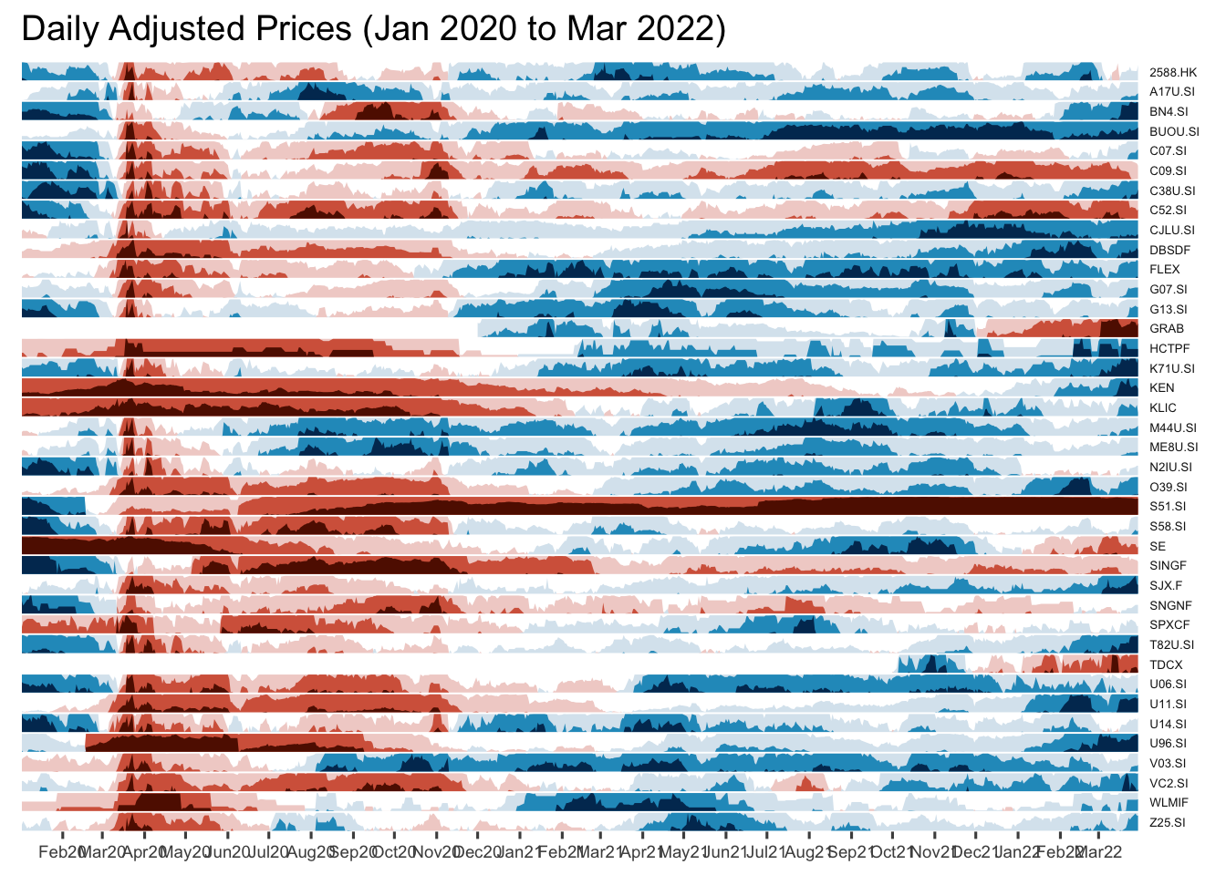
Horizon graph makeover
Instead of showing stock code, the stock name will be displayed.
Adding reference lines
Step 1: left_join() of dplyr package is used to append fields from company data.frame onto Stock_daily data.frame. Next select() is used to select columns 1 to 8 and 11 to 12.
Stock40_daily <- Stock40_daily %>%
  left_join(company) %>%
  select(1:8, 11:12)
Step 2: geom_vline() is used to add the vertical reference lines.
Stock40_daily %>%
  ggplot() +
  geom_horizon(aes(x = date, y=adjusted), origin = "midpoint", horizonscale = 6)+
  facet_grid(Name~.)+ #<<
  geom_vline(xintercept = as.Date("2020-03-11"), colour = "grey15", linetype = "dashed", size = 0.5)+ #<<
  geom_vline(xintercept = as.Date("2020-12-14"), colour = "grey15", linetype = "dashed", size = 0.5)+ #<<
  theme_few() +
  scale_fill_hcl(palette = 'RdBu') +
  theme(panel.spacing.y=unit(0, "lines"),
        strip.text.y = element_text(size = 5, angle = 0, hjust = 0),
    legend.position = 'none',
    axis.text.y = element_blank(),
    axis.text.x = element_text(size=7),
    axis.title.y = element_blank(),
    axis.title.x = element_blank(),
    axis.ticks.y = element_blank(),
    panel.border = element_blank()
    ) +
  scale_x_date(expand=c(0,0), date_breaks = "1 month", date_labels = "%b%y") +
ggtitle('Daily Adjusted Prices (Jan 2020 to Mar 2022)') 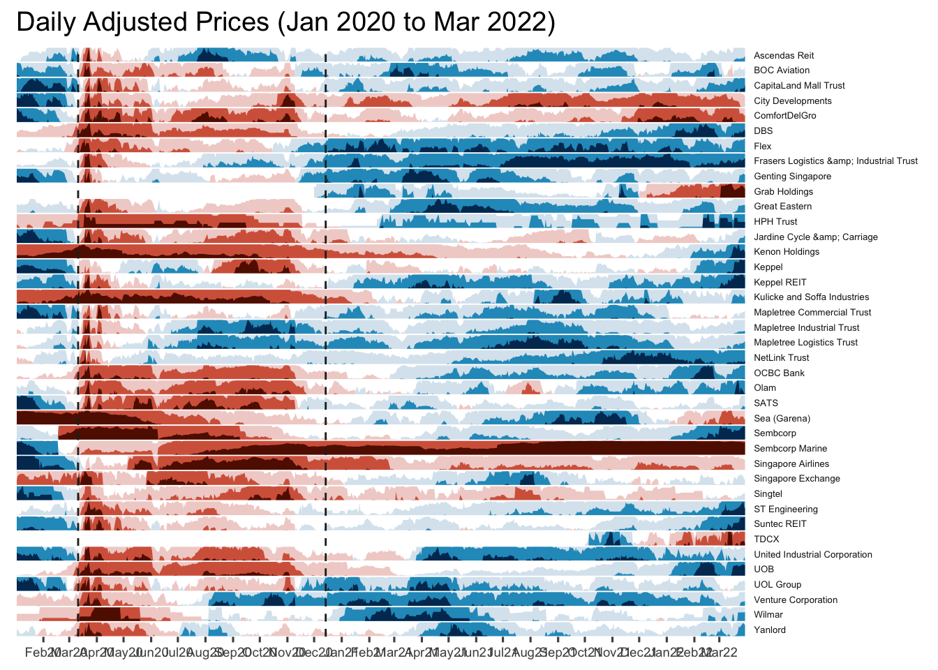
Plotting Stock Price Line Graph: ggplot methods
In the code chunk below, geom_line() of ggplot2 is used to plot the stock prices.
Stock40_daily %>%
  filter(symbol == "DBSDF") %>%
  ggplot(aes(x = date, y = close)) +
    geom_line() +
    labs(title = "DBS Group Holdings Ltd (DBSDF) Daily Stock Price",
         y = "Closing Price", x = "") +
    theme_tq()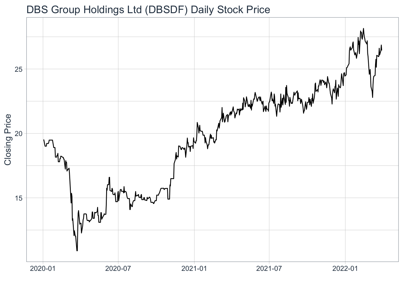
Plotting interactive stock price line graphs
In this section, we will create interactive line graphs for four selected stocks.
Step 1: Selecting the four stocks of interest
selected_stocks <-  Stock40_daily %>%
  filter (`symbol` == c("C09.SI", "SINGF", "SNGNF", "C52.SI"))
Step 2: Plotting the line graphs by using ggplot2 functions and ggplotly() of plotly R package
p <- ggplot(selected_stocks,
            aes(x = date, y = adjusted)) +
  scale_y_continuous() +
  geom_line() +
  facet_wrap(~Name, scales = "free_y",) +
  theme_tq() +
  labs(title = "Daily stock prices of selected weak stocks",
       x = "", y = "Adjusted Price") +
  theme(axis.text.x = element_text(size = 6),
        axis.text.y = element_text(size = 6))

ggplotly(p)
Plotting Candlestick Chart: tidyquant method
In this section, you will learn how to plot candlestick chart by using geom_candlestick() of tidyquant package.
Before plotting the candlesticks, the code chunk below will be used to define the end data parameter. It will be used when setting date limits throughout the examples.
end <- as_date("2022-03-31")Now we are ready to plot the candlesticks by using the code chunk below.
Stock40_daily %>%
  filter(symbol == "DBSDF") %>%
  ggplot(aes(
    x = date, y = close)) +
  geom_candlestick(aes(
    open = open, high = high,
    low = low, close = close)) +
  geom_line(size = 0.5)+
    coord_x_date(xlim = c(end - weeks(12),
                          end),
                 ylim = c(20, 35),
                 expand = TRUE) +
  labs(title = "DBS Group Holdings Ltd (DBSDF) Daily Stock Price",
       y = "Closing Price", x = "") +
  theme_tq()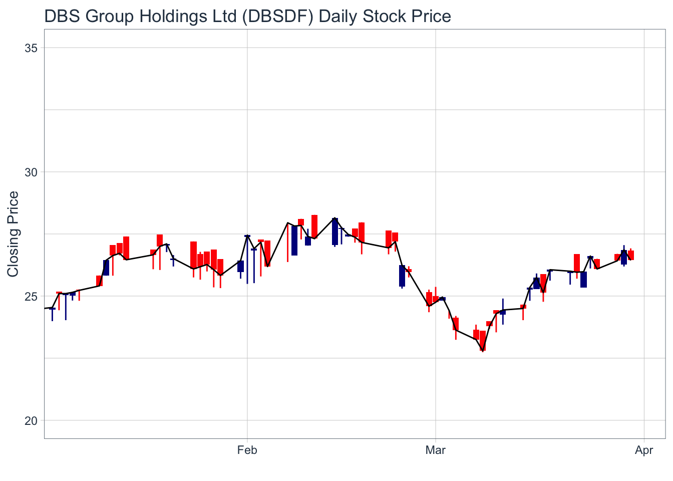
Plotting candlestick chart and MA lines: tidyquant method
Stock40_daily %>%
  filter(symbol == "DBSDF") %>%
  ggplot(aes(
    x = date, y = close)) +
  geom_candlestick(aes(
    open = open, high = high,
    low = low, close = close)) +
  geom_line(size = 0.5)+
  geom_ma(color = "darkgreen", n = 20) +
  geom_ma(color = "lightgreen", n = 5) +
    coord_x_date(xlim = c(end - weeks(12),
                          end),
                 ylim = c(20, 35),
                 expand = TRUE) +
  labs(title = "DBS Group Holdings Ltd (DBSDF) Daily Stock Price",
       subtitle = "darkgreen = 1-day MA, lightgreen = 5-day MA",
       y = "Closing Price", x = "") +
  theme_tq()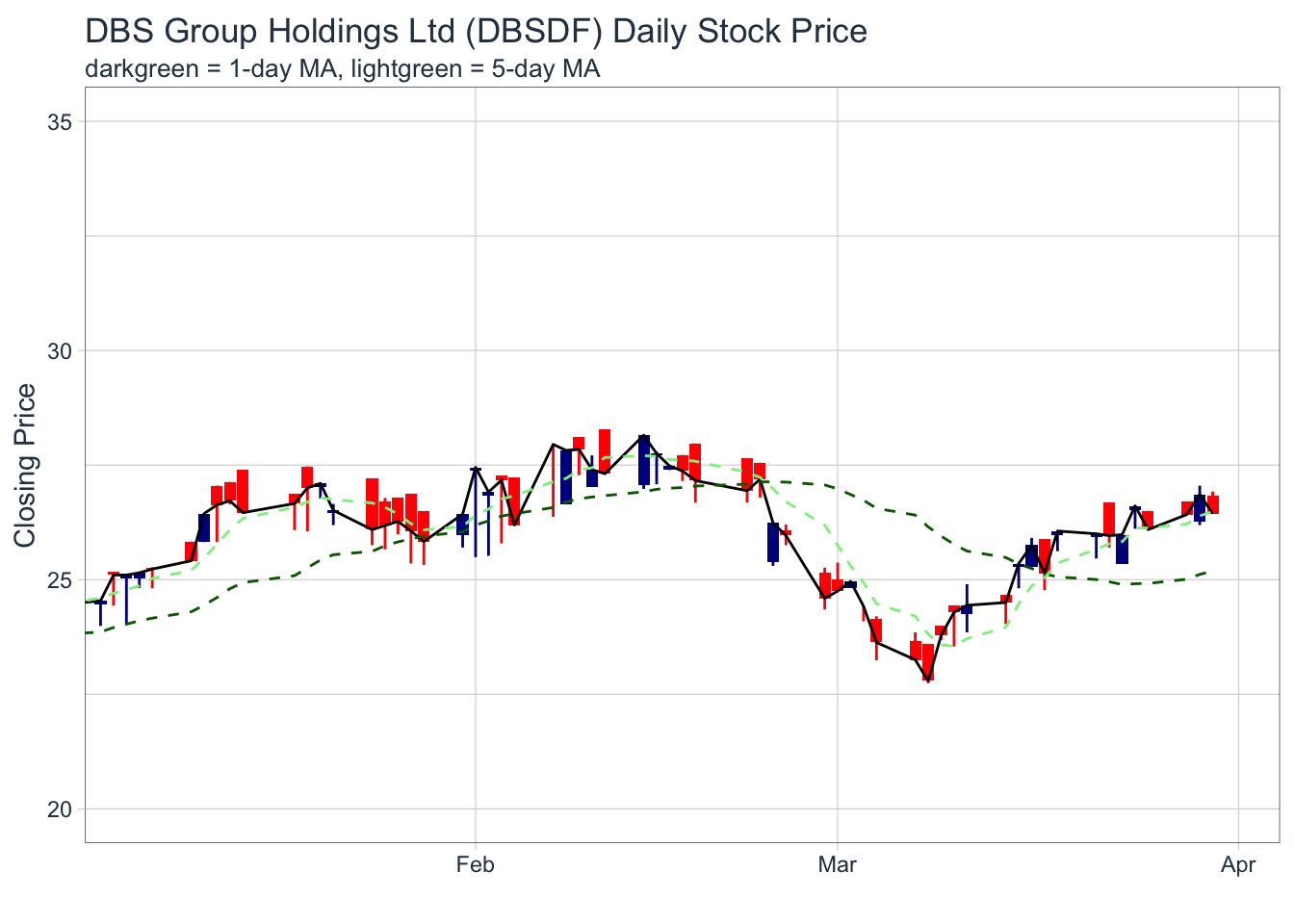
Things to learn from the code chunk:
Plotting Bollinger Bands: tidyquant method
In this section, you will learn how to plot bollinger bands by using geom_bbands() of tidyquant package.
Stock40_daily %>%
  filter(symbol == "DBSDF") %>%
  ggplot(aes(x=date, y=close))+
  geom_line(size=0.5)+
  geom_bbands(aes(
    high = high, low = low, close = close),
    ma_fun = SMA, sd = 2, n = 20,
    size = 0.75, color_ma = "royalblue4",
    color_bands = "red1")+
    coord_x_date(xlim = c("2020-02-01",
                          "2022-03-31"),
                 expand = TRUE)+
    labs(title = "DBS Group Holdings Ltd (DBSDF) Daily Stock Price",
         subtitle = "dotted red lines = bollinger bands",
         x = "Date", y ="Price") +
theme(legend.position="none")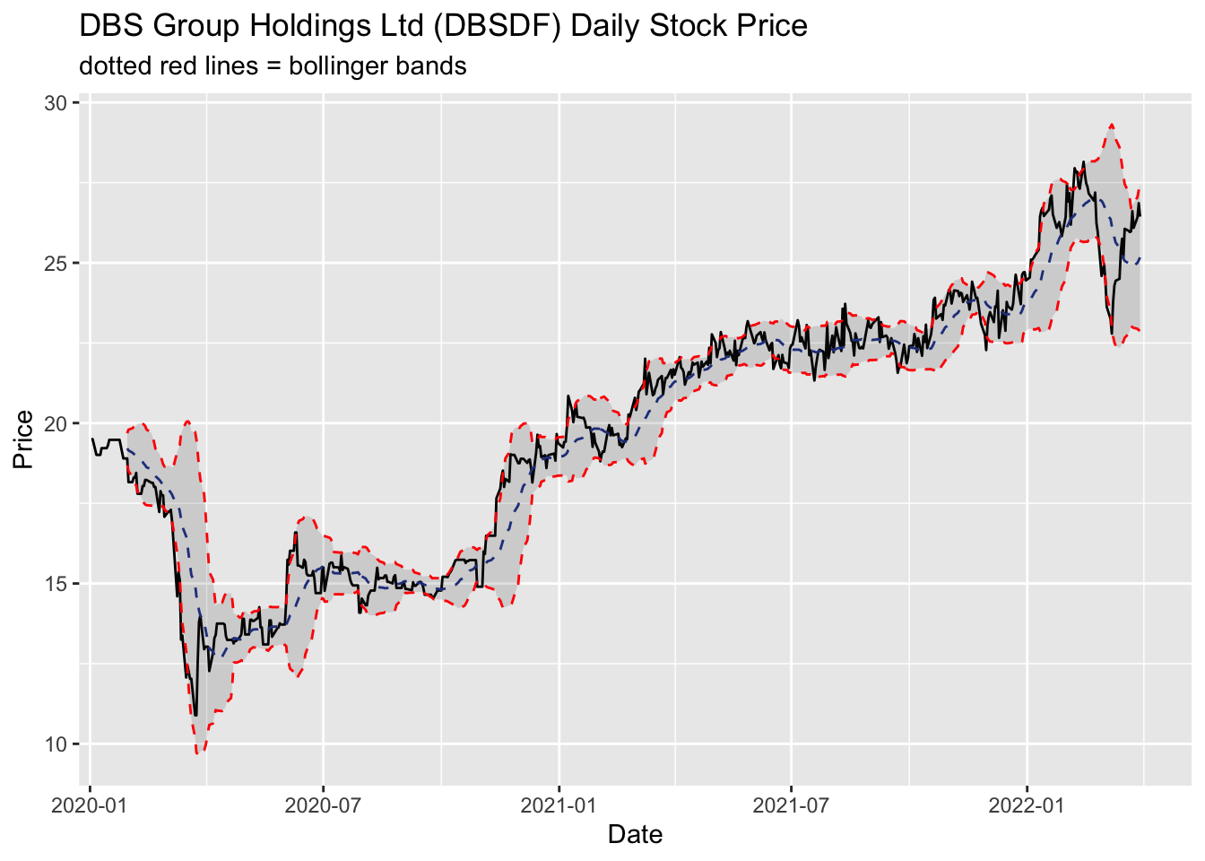
Things you can learn from the code chunk:
Plotting Interactive Candlesticks Chart: ggplot2 and plotly R method
First, a candleStick_plot function is written as follows:
candleStick_plot<-function(symbol, from, to){
  tq_get(symbol, from = from, to = to, warnings = FALSE) %>%
    mutate(greenRed=ifelse(open-close>0, "Red", "Green")) %>%
    ggplot()+
    geom_segment(
      aes(x = date, xend=date, y =open, yend =close, colour=greenRed),
      size=3)+
    theme_tq()+
    geom_segment(
      aes(x = date, xend=date, y =high, yend =low, colour=greenRed))+
    scale_color_manual(values=c("ForestGreen","Red"))+
    ggtitle(paste0(symbol," (",from," - ",to,")"))+
    theme(legend.position ="none",
          axis.title.y = element_blank(),
          axis.title.x=element_blank(),
          axis.text.x = element_text(angle = 0, vjust = 0.5, hjust=1),
          plot.title= element_text(hjust=0.5))
}
Credit: I learned this trick from RObservations #12: Making a Candlestick plot with the ggplot2 and tidyquant packages
p <- candleStick_plot("DBSDF",
                      from = '2022-01-01',
                      to = today())
ggplotly(p)