pacman::p_load(tidyverse, plotly, crosstalk, DT, ggdist, gganimate, ggpubr)Hands-on Exercise 04.2
Visualising Uncertainty
Visualizing the uncertainty of point estimates
A point estimate is a single number, such as a mean.
Uncertainty is expressed as standard error, confidence interval, or credible interval
Important:
- Don’t confuse the uncertainty of a point estimate with the variation in the sample
exam <- read_csv("data/Exam_data.csv")Rows: 322 Columns: 7
── Column specification ────────────────────────────────────────────────────────
Delimiter: ","
chr (4): ID, CLASS, GENDER, RACE
dbl (3): ENGLISH, MATHS, SCIENCE
ℹ Use `spec()` to retrieve the full column specification for this data.
ℹ Specify the column types or set `show_col_types = FALSE` to quiet this message.Visualizing the uncertainty of point estimates: ggplot2 methods
The code chunk below performs the followings:
group the observation by RACE,
computes the count of observations, mean, standard deviation and standard error of Maths by RACE, and
save the output as a tibble data table called
my_sum.
my_sum <- exam %>%
  group_by(RACE) %>%
  summarise(
    n=n(),
    mean=mean(MATHS),
    sd=sd(MATHS)
    ) %>%
  mutate(se=sd/sqrt(n-1))
Note: For the mathematical explanation, please refer to Slide 20 of Lesson 4.
Next, the code chunk below will
knitr::kable(head(my_sum), format = 'html')| RACE | n | mean | sd | se |
|---|---|---|---|---|
| Chinese | 193 | 76.50777 | 15.69040 | 1.132357 |
| Indian | 12 | 60.66667 | 23.35237 | 7.041005 |
| Malay | 108 | 57.44444 | 21.13478 | 2.043177 |
| Others | 9 | 69.66667 | 10.72381 | 3.791438 |
Visualizing the uncertainty of point estimates: ggplot2 methods
The code chunk below is used to reveal the standard error of mean maths score by race.
ggplot(my_sum) +
  geom_errorbar(
    aes(x=RACE,
        ymin=mean-se,
        ymax=mean+se),
    width=0.2,
    colour="black",
    alpha=0.9,
    size=0.5) +
  geom_point(aes
           (x=RACE,
            y=mean),
           stat="identity",
           color="red",
           size = 1.5,
           alpha=1) +
  ggtitle("Standard error of mean
          maths score by rac")
Warning: Using `size` aesthetic for lines was deprecated in ggplot2 3.4.0.
ℹ Please use `linewidth` instead.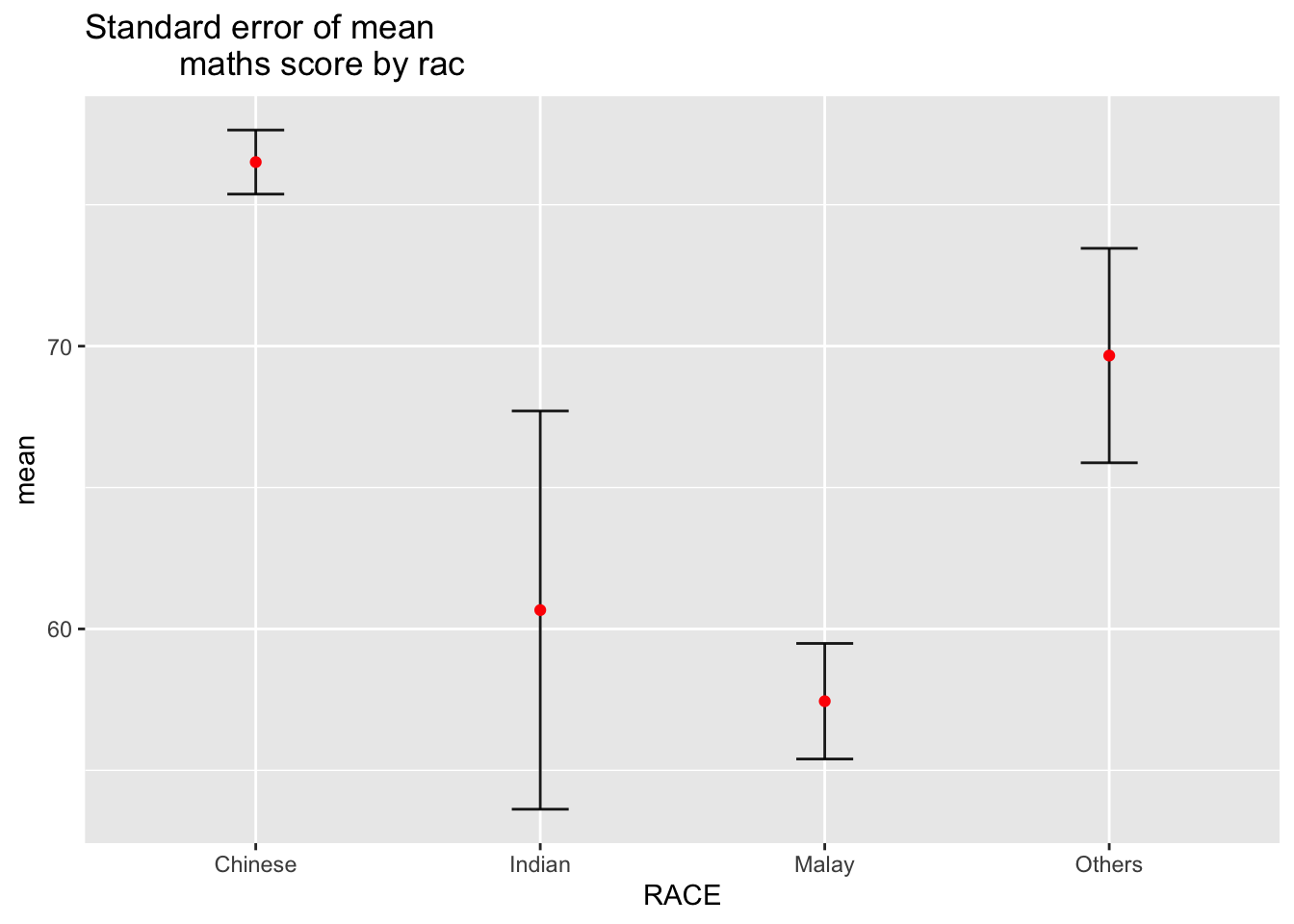
Visualizing the uncertainty of point estimates: ggplot2 methods
ggplot(my_sum) +
  geom_errorbar(
    aes(x=reorder(RACE,-mean),
        ymin=mean-se,
        ymax=mean+se),
    width=0.2,
    colour="black",
    alpha=0.95,
    size=0.5) +
  geom_point(aes
           (x=RACE,
            y=mean),
           stat="identity",
           color="red",
           size = 1.5,
           alpha=1) +
  ggtitle("95% confidence interval of mean maths score by race")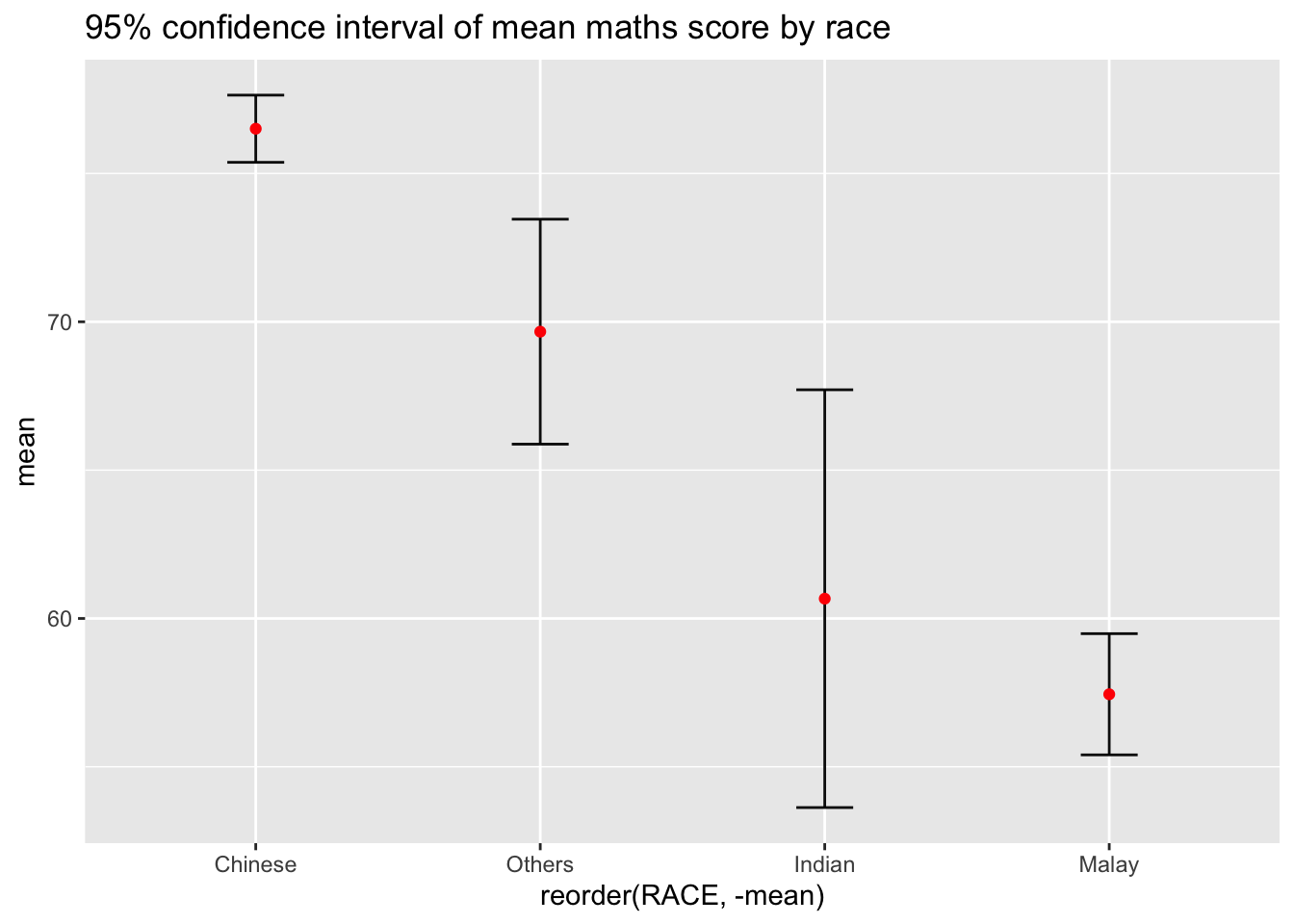
Visualizing the uncertainty of point estimates with interactive error bars
p <- ggplot(my_sum) +
  geom_errorbar(
    aes(x=reorder(RACE,-mean),
        ymin=mean-se,
        ymax=mean+se),
    width=0.2,
    colour="black",
    alpha=0.99,
    size=0.5) +
  geom_point(aes
           (x=RACE,
            y=mean),
           stat="identity",
           color="red",
           size = 1.5,
           alpha=1) +
  ggtitle("99% confidence interval of mean maths score by race")

pp <- highlight(ggplotly(p))

d <- highlight_key(my_sum)

crosstalk::bscols(pp,
                  DT::datatable(d))
Visualising Uncertainty: ggdist package
ggdist is an R package that provides a flexible set of ggplot2 geoms and stats designed especially for visualising distributions and uncertainty.
It is designed for both frequentist and Bayesian uncertainty visualization, taking the view that uncertainty visualization can be unified through the perspective of distribution visualization:
for frequentist models, one visualises confidence distributions or bootstrap distributions (see vignette(“freq-uncertainty-vis”));
for Bayesian models, one visualises probability distributions (see the tidybayes package, which builds on top of ggdist).
Visualizing the uncertainty of point estimates: ggdist methods
In the code chunk below, stat_pointinterval() of ggdist is used to build a visual for displaying distribution of maths scores by race.
exam %>%
  ggplot(aes(x = RACE,
             y = MATHS)) +
  stat_pointinterval() +   #<<
  labs(
    title = "Visualising confidence intervals of mean math score",
    subtitle = "Mean Point + Multiple-interval plot")
Gentle advice: This function comes with many arguments, students are advised to read the syntax reference for more detail.
exam %>%
  ggplot(aes(x = RACE, y = MATHS)) +
  stat_pointinterval(.width = 0.95,
  .point = median,
  .interval = qi) +
  labs(
    title = "Visualising confidence intervals of mean math score",
    subtitle = "Mean Point + Multiple-interval plot")
Warning in layer_slabinterval(data = data, mapping = mapping, stat =
StatPointinterval, : Ignoring unknown parameters: `.point` and `.interval`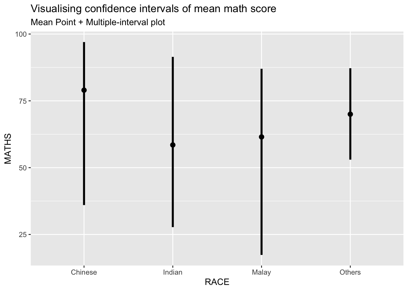
Visualizing the uncertainty of point estimates: ggdist methods
exam %>%
  ggplot(aes(x = RACE,
             y = MATHS)) +
  stat_pointinterval(
    show.legend = FALSE) +
  labs(
    title = "Visualising confidence intervals of mean math score",
    subtitle = "Mean Point + Multiple-interval plot")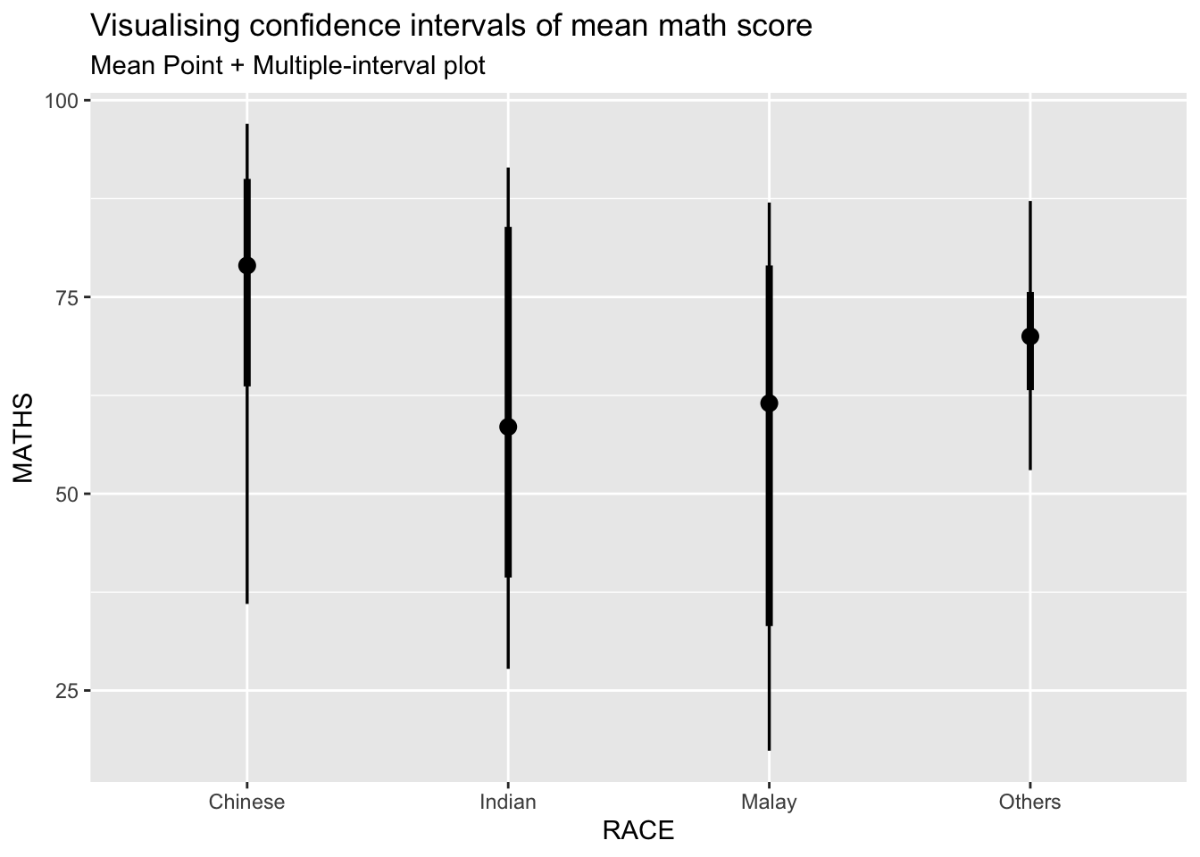
Gentle advice: This function comes with many arguments, students are advised to read the syntax reference for more detail.
Visualizing the uncertainty of point estimates: ggdist methods
In the code chunk below, stat_gradientinterval() of ggdist is used to build a visual for displaying distribution of maths scores by race.
exam %>%
  ggplot(aes(x = RACE,
             y = MATHS)) +
  stat_gradientinterval(
    fill = "skyblue",
    show.legend = TRUE
  ) +
  labs(
    title = "Visualising confidence intervals of mean math score",
    subtitle = "Gradient + interval plot")
Warning: fill_type = "gradient" is not supported by the current graphics device.
- Falling back to fill_type = "segments".
- If you believe your current graphics device *does* support
fill_type = "gradient" but auto-detection failed, set that option
explicitly and consider reporting a bug.
- See help("geom_slabinterval") for more information.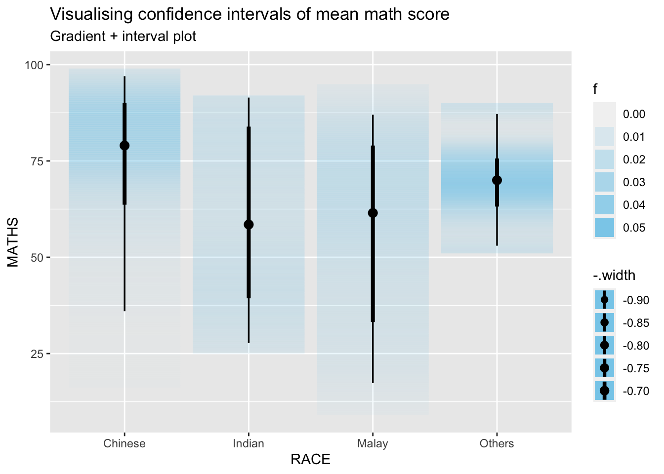
Gentle advice: This function comes with many arguments, students are advised to read the syntax reference for more detail.
Visualizing Uncertainty with Hypothetical Outcome Plots (HOPs)
Step 1: Installing ungeviz package
devtools::install_github("wilkelab/ungeviz")Skipping install of 'ungeviz' from a github remote, the SHA1 (aeae12b0) has not changed since last install.
Use `force = TRUE` to force installationNote: You only need to perform this step once.
Step 2: Launch the application in R
library(ungeviz)
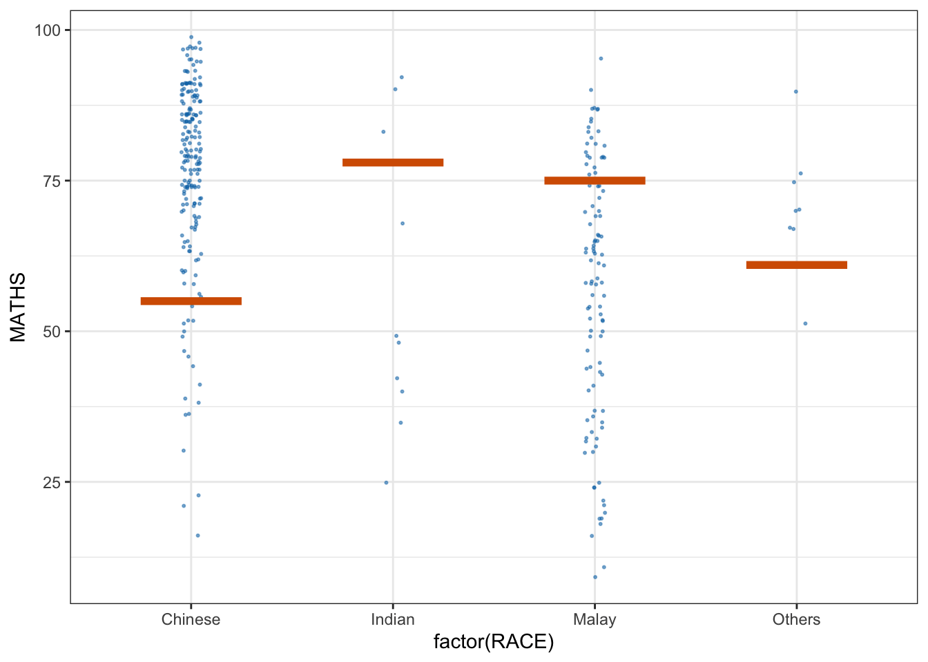
ggplot(data = exam,
(aes(x = factor(RACE), y = MATHS))) +
geom_point(position = position_jitter(
height = 0.3, width = 0.05),
size = 0.4, color = "#0072B2", alpha = 1/2) +
geom_hpline(data = sampler(25, group = RACE), height = 0.6, color = "#D55E00") +
theme_bw() +
# `.draw` is a generated column indicating the sample draw
transition_states(.draw, 1, 3)Warning in geom_hpline(data = sampler(25, group = RACE), height = 0.6, color =
"#D55E00"): Ignoring unknown parameters: `height`Warning: Using the `size` aesthetic in this geom was deprecated in ggplot2 3.4.0.
ℹ Please use `linewidth` in the `default_aes` field and elsewhere instead.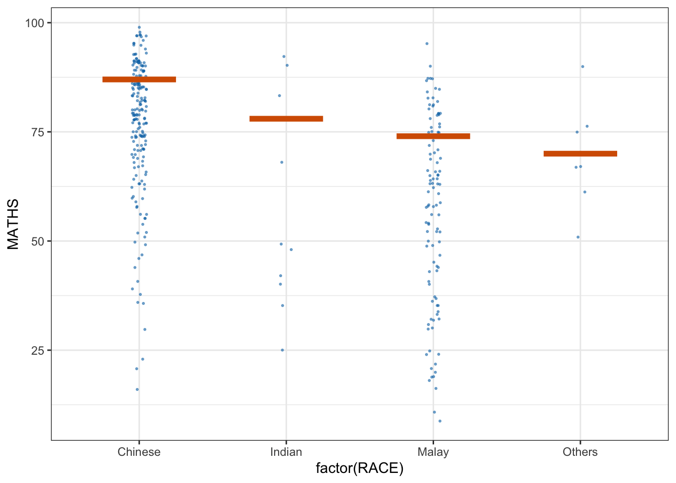
Visualizing Uncertainty with Hypothetical Outcome Plots (HOPs)
ggplot(data = exam,
       (aes(x = factor(RACE),
            y = MATHS))) +
  geom_point(position = position_jitter(
    height = 0.3,
    width = 0.05),
    size = 0.4,
    color = "#0072B2",
    alpha = 1/2) +
  geom_hpline(data = sampler(25,
                             group = RACE),
              height = 0.6,
              color = "#D55E00") +
  theme_bw() +
  transition_states(.draw, 1, 3)
Warning in geom_hpline(data = sampler(25, group = RACE), height = 0.6, color =
"#D55E00"): Ignoring unknown parameters: `height`