pacman::p_load(corrplot, tidyverse, ggtern, ggstatsplot, ggcorrplot, plotly, seriation, dendextend, heatmaply)In-Class Exercise 05
Overview
This is a walk through of In-Class Exercise 5
Getting Started
Installing and Launching R Packages
Importing and Preparing The Data Set
wine <- read_csv("data/wine_quality.csv")pop_data <- read_csv("data/respopagsex2000to2018_tidy.csv") wh <- read_csv("data/WHData-2018.csv")
row.names(wh) <- wh$Country
wh1 <- dplyr::select(wh, c(3, 7:12))
wh_matrix <- data.matrix(wh)Building the Correlation Matrix
Building a basic correlation matrix
Figure below shows the scatter plot matrix of Wine Quality Data. It is a 11 by 11 matrix.
pairs(wine[,1:11])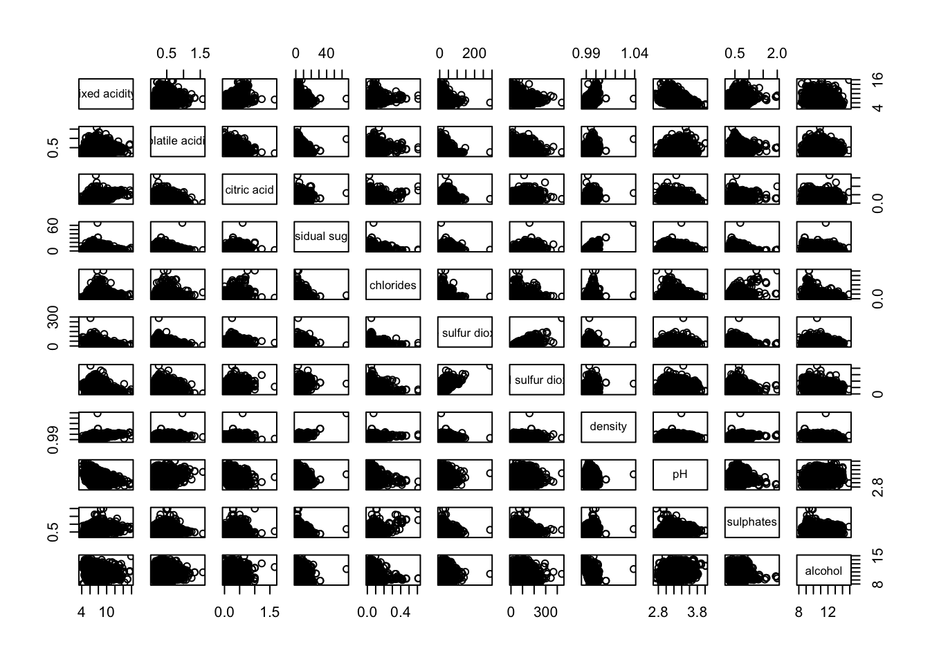
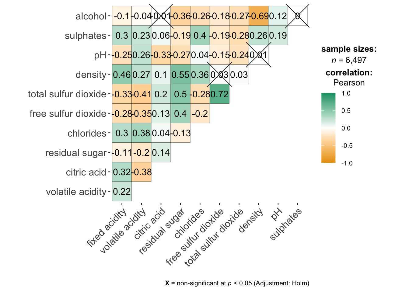
Visualizing Correlation Matrix: ggcormat()
On of the advantage of using ggcorrmat() over many other methods to visualise a correlation matrix is it’s ability to provide a comprehensive and yet professional statistical report as shown in the figure below.
ggstatsplot::ggcorrmat(
  data = wine,
  cor.vars = 1:11)
Note
code cannot run due to ggcorrmat() is in conflict with ggtern(). Processed image will be presented instead.
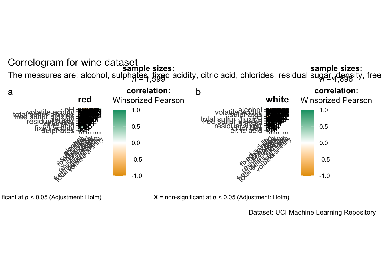
Building multiple plots
Since ggstasplot is an extension of ggplot2, it also supports faceting. However the feature is not available in ggcorrmat() but in the grouped_ggcorrmat() of ggstatsplot.
grouped_ggcorrmat(
  data = wine,
  cor.vars = 1:11,
  grouping.var = type,
  type = "robust",
  p.adjust.method = "holm",
  plotgrid.args = list(ncol = 2),
  ggcorrplot.args = list(outline.color = "black",
                         hc.order = TRUE,
                         tl.cex = 10),
  annotation.args = list(
    tag_levels = "a",
    title = "Correlogram for wine dataset",
    subtitle = "The measures are: alcohol, sulphates, fixed acidity, citric acid, chlorides, residual sugar, density, free sulfur dioxide and volatile acidity",
    caption = "Dataset: UCI Machine Learning Repository"
  )
)
Getting started with corrplot
Before we can plot a corrgram using corrplot(), we need to compute the correlation matrix of wine data frame.
In the code chunk below, cor() of R Stats is used to compute the correlation matrix of wine data frame.
wine.cor <- cor(wine[, 1:11])
corrplot(wine.cor)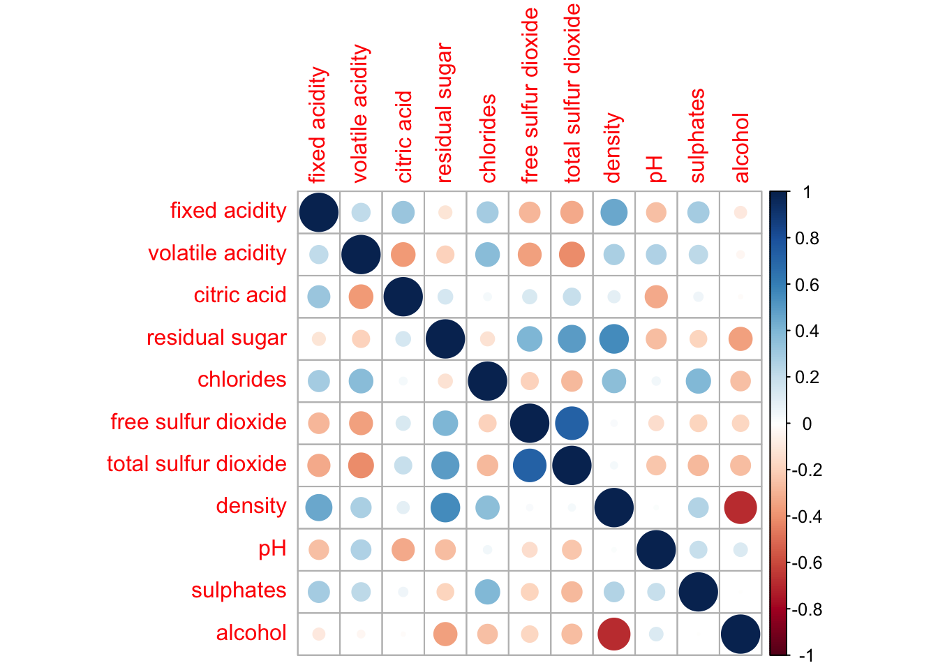
Plotting Ternary Diagram with R
Preparing the Data
Next, use the mutate() function of dplyr package to derive three new measures, namely: young, active, and old.
agpop_mutated <- pop_data %>%
  mutate(`Year` = as.character(Year))%>%
  spread(AG, Population) %>%
  mutate(YOUNG = rowSums(.[4:8]))%>%
  mutate(ACTIVE = rowSums(.[9:16]))  %>%
  mutate(OLD = rowSums(.[17:21])) %>%
  mutate(TOTAL = rowSums(.[22:24])) %>%
  filter(Year == 2018)%>%
  filter(TOTAL > 0)
Plotting a static ternary diagram
Use ggtern() function of ggtern package to create a simple ternary plot.
ggtern(data=agpop_mutated,aes(x=YOUNG,y=ACTIVE, z=OLD)) +
  geom_point()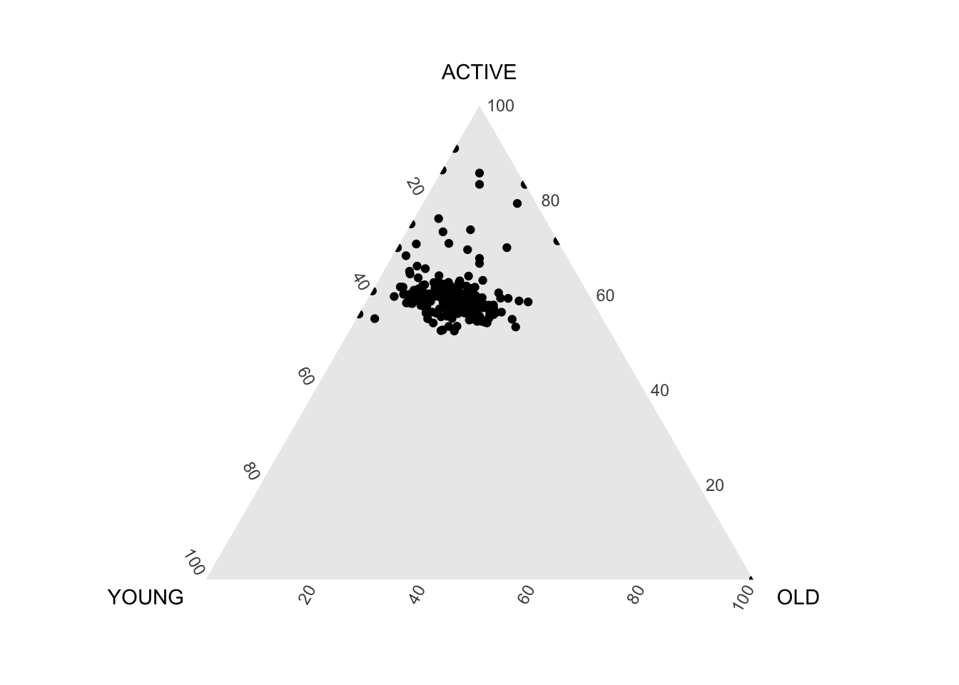
ggtern(data=agpop_mutated, aes(x=YOUNG,y=ACTIVE, z=OLD)) +
  geom_point() +
  labs(title="Population structure, 2015") +
  theme_rgbw()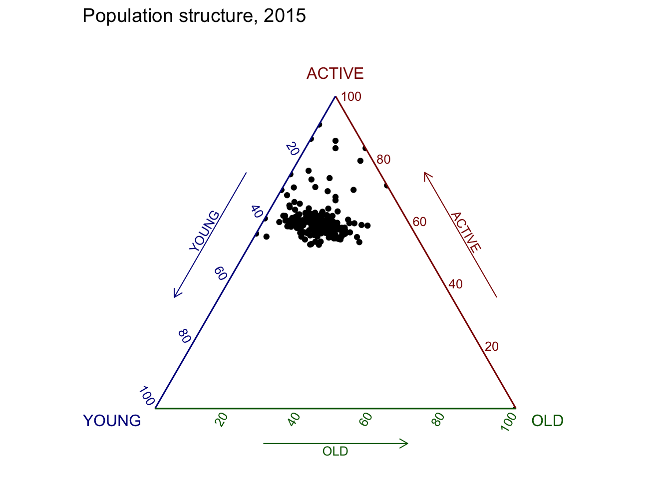
Plotting an interative ternary diagram
The code below create an interactive ternary plot using plot_ly() function of Plotly R.
label <- function(txt) {
  list(
    text = txt,
    x = 0.1, y = 1,
    ax = 0, ay = 0,
    xref = "paper", yref = "paper",
    align = "center",
    font = list(family = "serif", size = 15, color = "white"),
    bgcolor = "#b3b3b3", bordercolor = "black", borderwidth = 2
  )
}

axis <- function(txt) {
  list(
    title = txt, tickformat = ".0%", tickfont = list(size = 10)
  )
}

ternaryAxes <- list(
  aaxis = list(color = "blue",
               title = "Young"),
  baxis = list(color = "red",
               title = "Active"),
  caxis = list(color = "green",
               title = "Old")
)

plot_ly(
  agpop_mutated,
  a = ~YOUNG,
  b = ~ACTIVE,
  c = ~OLD,
  color = I("black"),
  type = "scatterternary"
) %>%
  layout(
    annotations = label("Ternary Markers"),
    ternary = ternaryAxes
  )
Creating Interactive Heatmap
Getting Started with Heatmaps
heatmaply uses the seriation package to find an optimal ordering of rows and columns. Optimal means to optimize the Hamiltonian path length that is restricted by the dendrogram structure. This, in other words, means to rotate the branches so that the sum of distances between each adjacent leaf (label) will be minimized. This is related to a restricted version of the travelling salesman problem.
Here we meet our first seriation algorithm: Optimal Leaf Ordering (OLO). This algorithm starts with the output of an agglomerative clustering algorithm and produces a unique ordering, one that flips the various branches of the dendrogram around so as to minimize the sum of dissimilarities between adjacent leaves. Here is the result of applying Optimal Leaf Ordering to the same clustering result as the heatmap above.
heatmaply(normalize(wh_matrix[, -c(1, 2, 4, 5)]),
          seriate = "OLO")
Finishing Touches
Beside providing a wide collection of arguments for meeting the statistical analysis needs, heatmaply also provides many plotting features to ensure cartographic quality heatmap can be produced.
In the code chunk below the following arguments are used:
k_row is used to produce 5 groups.
margins is used to change the top margin to 60 and row margin to 200.
fontsizw_row and fontsize_col are used to change the font size for row and column labels to 4.
main is used to write the main title of the plot.
xlab and ylab are used to write the x-axis and y-axis labels respectively.
heatmaply(normalize(wh_matrix[, -c(1, 2, 4, 5)]),
          Colv=NA,
          seriate = "none",
          colors = Blues,
          k_row = 5,
          margins = c(NA,200,60,NA),
          fontsize_row = 4,
          fontsize_col = 5,
          main="World Happiness Score and Variables by Country, 2018 \nDataTransformation using Normalise Method",
          xlab = "World Happiness Indicators",
          ylab = "World Countries"
          )